
<!DOCTYPE html>
<html lang="ko">

<head>
    <meta charset="UTF-8">
    <meta http-equiv="X-UA-Compatible" content="IE=edge">
    <meta name="viewport" content="width=device-width, initial-scale=1.0">
    <title>단추만들기</title>
    <style>
        .box {
            text-decoration: none;
            display:inline-block;
            /* width와 height 지정이 가능하면서 옆으로 붙혀나가게 해주는 기능 */
            width: 200px;
            height:200px;
            /* background-color: gray; */
            border-radius: 50%;
            text-align: center;
            line-height: 200px;
            box-shadow: 1px 1px 5px 1px rgba(0,0,0,0.3);
            /* 가로/세로/블러/크기/색깔 */
            font-size: 30px;
            margin-left: 5px;
            /* 공간띄우기 */
            color: black;
            transition: all 0.1s;
        }

        .box:hover{
            box-shadow: 1px 1px 5px 1px rgba(0,0,0,0.7);

        }
    </style>
</head>

<body>
    <a href="#" class="box">1</a>
    <a href="#" class="box">2</a>
    <a href="#" class="box">3</a>
    <a href="#" class="box">4</a>
</body>

</html>
<!DOCTYPE html>
<html lang="en">

<head>
    <meta charset="UTF-8">
    <meta http-equiv="X-UA-Compatible" content="IE=edge">
    <meta name="viewport" content="width=device-width, initial-scale=1.0">
    <title>flex</title>
    <style>
        *{margin:0; padding:0;}
        *{font-size: 10px;}
        .outBox{
            display: flex;
            justify-content: space-around;
            width: 800px;
            height: 500px;
            background-color:  gray;
            /* 화면 전체 비율에 따른 크기 vw vh  */
        }
        .inBox{
            width: 100px;
            height: 300px;
            background-color: aqua;
        }

        h4 {font-size: 4rem;}
    </style>
</head>

<body>
    <div class="outBox">
        <div class="inBox"></div>
        <div class="inBox"></div>
        <div class="inBox"></div>
    </div>

</body>

</html>
<!DOCTYPE html>
<html lang="en">
<head>
<meta charset="UTF-8">
<meta http-equiv="X-UA-Compatible" content="IE=edge">
<meta name="viewport" content="width=device-width, initial-scale=1.0">
<title>Document</title>
<style>
*{*margin: 0;padding: 0;}
ul{
display: flex;
/* 옆으로 붙게 */
justify-content: space-around;
width: 1000px;
height: 500px;
background-color: lightgray;
list-style: none;
/* 점 등 기호 없애게 하는 방법 */
}
li{
display: flex;
flex-direction: column;
/* 주축이 변경되고 항목들은 열로 나열 */
justify-content: center;
width: 200px;
height: 350px;
background-color: aqua;
}
h3{
font-size: 20px;
font-weight: bold;
}
img{
width:80%;
}
</style>
</head>
<body>
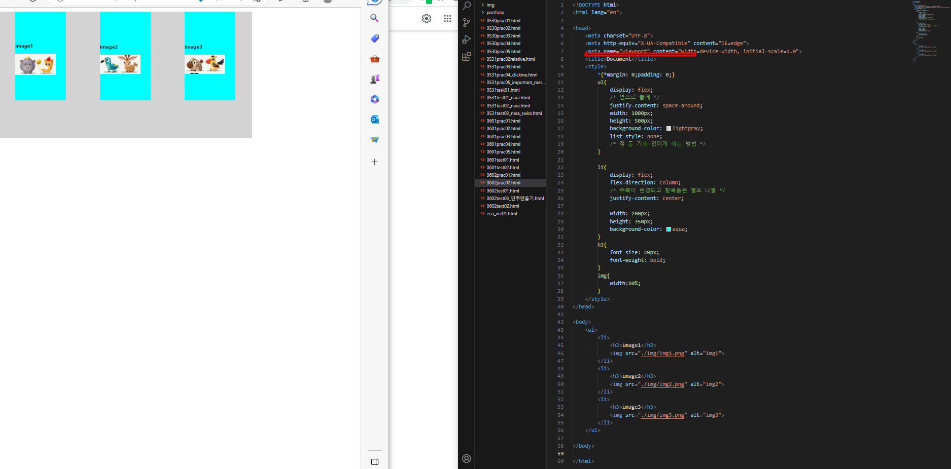
<ul>
<li>
<h3>image1</h3>
<img src="./img/img1.png" alt="img1">
</li>
<li>
<h3>image2</h3>
<img src="./img/img2.png" alt="img2">
</li>
<li>
<h3>image3</h3>
<img src="./img/img3.png" alt="img3">
</li>
</ul>
</body>
</html>
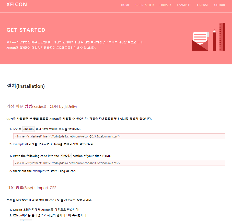
XEICON 사이트 활용하여 CSS 이모티콘 활용하는 방법
XEICon은 웹사이트 제작에 최적화된 벡터 그래픽 아이콘 툴킷입니다.
http://xpressengine.github.io/XEIcon/index.html
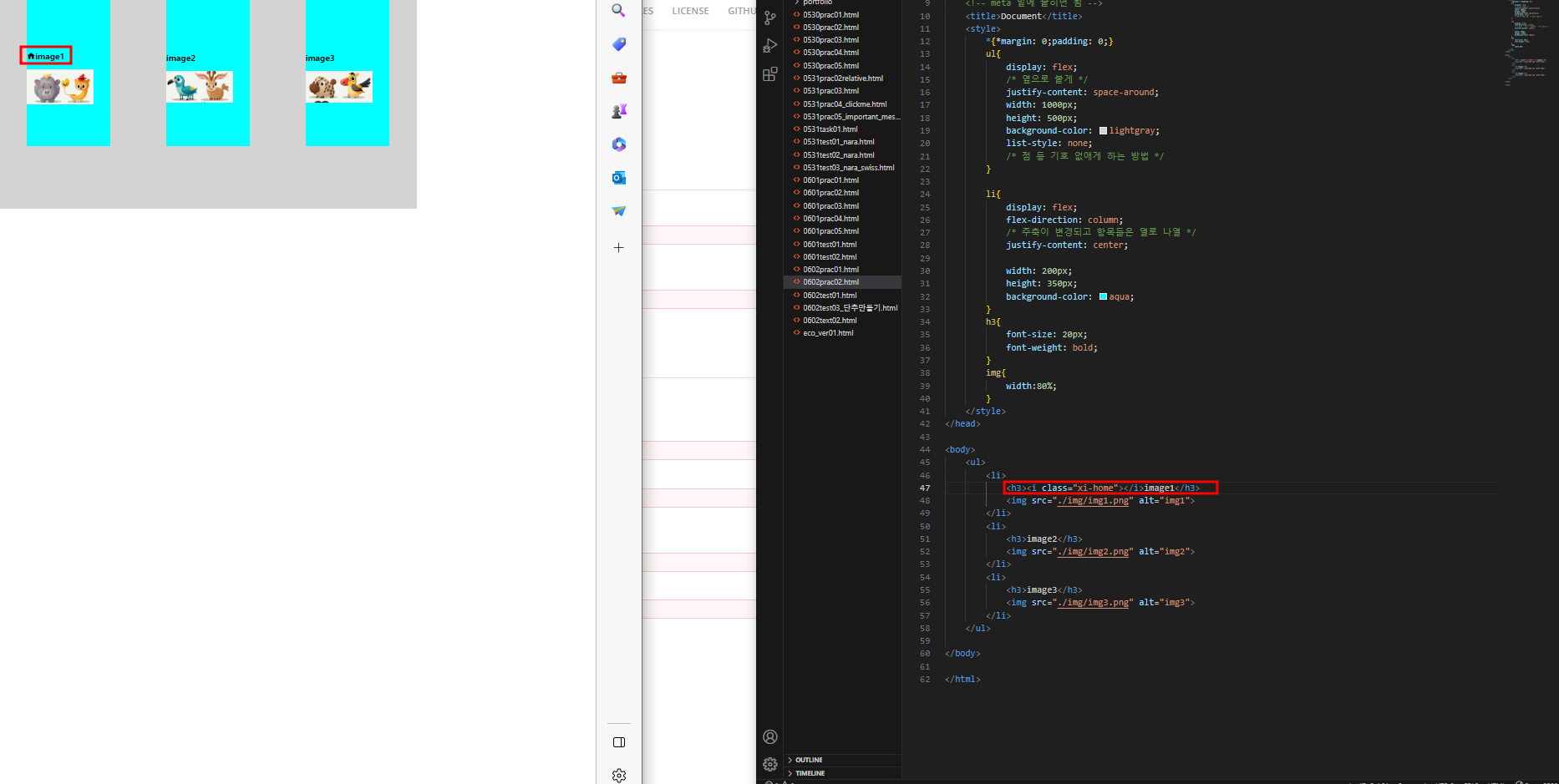
1.사이트에 나와있는 설치 코드를 작업할 HTML코드 meta 밑에 붙히기
<link rel="stylesheet" href="//cdn.jsdelivr.net/npm/xeicon@2.3.3/xeicon.min.css">여기에다가 붙혀넣어 줍니다.
2.body에 붙혀넣기
<i class="xi-xpressengine"></i><h3> 태그 옆에다가도 이렇게 넣어주시면 홈 모양이 입력됩니다.
붙히고 난 후의 완성 코드본
<!DOCTYPE html>
<html lang="en">

<head>
    <meta charset="UTF-8">
    <meta http-equiv="X-UA-Compatible" content="IE=edge">
    <meta name="viewport" content="width=device-width, initial-scale=1.0">
    <link rel="stylesheet" href="//cdn.jsdelivr.net/npm/xeicon@2.3.3/xeicon.min.css">
    <!-- meta 밑에 붙히면 됨 -->
    <title>Document</title>
    <style>
        *{*margin: 0;padding: 0;}
        ul{
            display: flex;
            /* 옆으로 붙게 */
            justify-content: space-around;
            width: 1000px;
            height: 500px;
            background-color: lightgray;
            list-style: none;
            /* 점 등 기호 없애게 하는 방법 */
        }

        li{
            display: flex;
            flex-direction: column;
            /* 주축이 변경되고 항목들은 열로 나열 */
            justify-content: center;

            width: 200px;
            height: 350px;
            background-color: aqua;
        }
        h3{
            font-size: 20px;
            font-weight: bold;
        }
        img{
            width:80%;
        }
        .homebox{
            background-color: red;
        }
    </style>
</head>

<body>
    <ul>
        <li>
            <h3><i class="xi-home"></i>image1</h3>
            <img src="./img/img1.png" alt="img1">
        </li>
        <li>
            <h3>image2</h3>
            <img src="./img/img2.png" alt="img2">
        </li>
        <li>
            <h3>image3</h3>
            <img src="./img/img3.png" alt="img3">
        </li>
    </ul>

</body>

</html>
마지막 꿀팁!!
wrap활용법
컨테이너를 자유자재로 컨트롤 하기 위해서는 wrap 을 잘 할줄알아야 합니다!
꼭 필요한 기능이고 저도 잘 할줄 몰라 예시 html 코드만 공유드립니다.

<!DOCTYPE html>
<html lang="en">

<head>
    <meta charset="UTF-8">
    <meta http-equiv="X-UA-Compatible" content="IE=edge">
    <meta name="viewport" content="width=device-width, initial-scale=1.0">
    <title>Document</title>
    <style>
        *{margin:0; padding:0;}
        ul {
            display: flex;
            justify-content: space-evenly;
            /* 열을 균등하게 */
            align-items: center;
            /* 플렉스 컨테이너의 기준선(baseline)을 중앙으로 */
            width: 60%;
            height: 500px;
            background-color: lightgray;
            list-style: none;
            flex-wrap: wrap;
            /* 나열 된 (정렬 된) 요소들의 총 넓이가 부모 넓이 보다 클 때, 다음 줄에 이어서 정렬 해주는 기능 */
        }

        li {
            display: flex;
            flex-direction: column;
            /* 주축이 변경되고 항목들은 열로 나열 */
            justify-content: center;
            text-align: center;
            font-size: 20px;
            width: 200px;
            height: 100px;
            background-color: lightskyblue;
            margin: 20px;

        }
    </style>
</head>

<body>
    <ul>
        <li>항목1</li>
        <li>항목2</li>
        <li>항목3</li>
        <li>항목4</li>
    </ul>

</body>

</html>'html' 카테고리의 다른 글
| html 레이아웃 만드는 방법 (0) | 2023.06.11 |
|---|---|
| CSS의 absolute position 및 애니메이션 작동 메커니즘 이해 (0) | 2023.06.09 |
| 다운로드 바 만드는 방법 (0) | 2023.06.08 |
| html 하단바 만드는 방법 (0) | 2023.06.07 |


